Tuesday 18 December 2012

Little Boxes


Heree is my entry for the Ranger Gift Wrap Ideas Contest


I have used Tim's Snowflake Blueprint stamp, clear embossing powder, Perfect medium, faded jeans and Iced spruce distress inks to decorate my boxes, tags and the bag which was what all of the enclosed gifts originally came in plus Ranger glossy accents to stick the boxes together.

I Stamped the image onto white card (and the bag) with perfect medium then embossed with clear powder to create a resist before distressing with the two colours, I found the combination of both perfectly matched my twine which has been used in all of my gift wrapping this year.  I spritzed and flicked water over the box lids and tags to give an effect of more snowflakes in the background.  I stamped out a few extra snowflakes and cut them out before sticking over the stamped flakes on the tags to create extra dimension.  I have added futher details on making the boxes below.

To make a box

Over the years I've heard lots of people say they find making boxes difficult. 
Manufacturers come out with all sorts of clever boards to make life easier yet I've never used anything but my fiskars paper trimmer and a ball embossing tool.  The paper trimmer does come with scoring blades but I find those too harsh and prefer the ball tool.  There are other trimmers will do the same job providing it has a built in ruler and works by sliding a cutting blade down a groove.  Apart from the trimmer and ball tool you will need good quality cardstock and some quick grab glue, I used glossy accents.

the M word

Like many I shy away from using the M word, amazing isn't it, we are crafters but so many of us hate maths!  Unfortunately we do have to do a little measuring here but you would have to do that whatever method you use to make a box so here goes.

Measure the object you wish to pack.  My first gift was round and was about 3" wide, and 4" tall.  Add about 1/2" to the width and length measurement or you won't be able to get your gift into the box.  Then multiply the height by 2 and add the width.

 So the maths is 3.5 +(4x2) = 11.5  Or two times height  plus width including wiggle room.  (you count the height twice because you are measuring down one side, across the bottom and back up the other side of the box.)  That gives you the first dimension.  If you want a rectangular box you will need to measure the length as well as width, Height will be the same as before remember its actual length of object plus 1/2" + (height x2).

My box was square so I now know I need a piece of cardstock 11 1/2" square for the base.  For the lid I simply add 1/8th inch all round so my finished lid piece needs to measure 11 5/8". 

I cut two pieces of cardstock the size of my lid piece and then trim 1/8th inch from two adjacent sides so both pieces are still square but one is a teensy bit smaller, the smaller piece is my base and I put that to one side whilst working on the lid.

 
The height of my object was 4" so I scored 4" in from the edge on all 4 sides (ending up with a 3 1/2" square in the middle)  I then marked diagonally from the outer corners to the corner of the middle square and cut out a triangle as shown.  I snipped off the points of the attached triangles (this makes a neater finish when glueing together).  Using a bone folder I then folded along each of the score lines.  At this point I decorated the box as detailed above, folding under each triangular flap so as not to get it inky but also to define the corner folds better.  Once decorated I folded the box into shape glueing each triangular flap to the inside of the adjacent side ensuring the corners remained straight.  Finally score cut and fold the base in exactly the same way, (4" from edge all round). 
 
Making the box this way you don't have to worry about a different set of scoring  measurements or using a different side of a scoring board, you have already deducted the size difference between base and top when you cut the pieces out.
 
I hope you will give this method a try, sorry I haven't put up more pictures and please let me know if it works for you.


Wednesday 5 December 2012

12 tags Christmas

It doesn't seem a year since we were dribbling over Tim Holtz Christmas tags yet its Christmas tagtime over at Tim's blog.  I'd like to enter this my take on one of his tags into the 12 tags of 2012 December competition.


I have utilised a previous idea borrowed from Hels Sheridan See earlier blog post for link to instructions) but needed to adapt the size of this gift-velope to incorporate the tag.  I did cut down the tags used to enable me to get two out of one sheet of 12" x 12" co oredinations cardstock.  I used papers from the holidays past ideaology paper stash and inked them all with iced spruce. 

To fasten I have fixed string under the front tag and wrapped it around the back of the card to tie around the glittered brad.

I used distress inks to watercolour the snowman which was stamped with Tim's Christmas blue print stamps and cut out and decoupaged onto the front tag. 

The snowflakes were cut from foiled card with the spellbinders 2012 set and coloured with aqua alcohol ink.

Monday 26 November 2012

Spellbinders altered metal 'Christmas 'bauble'

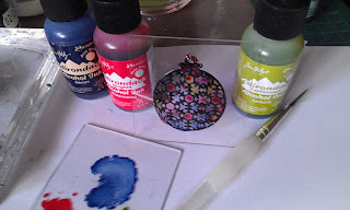
I wanted my Christmas tree to look more modern this year, that isn't to say I don't want traditional too but I need to change the colours I usually choose.  I don't have enough decorations in my chosen theme of blues, copper and cream so am attempting to make some.  I initially attempted to make this decoration from craft metal which has a copper colour to one side but it was very difficult to get the three sides to stick so for this, version 2 I stuck metal tape to quite thick kraft card and die cut three pieces using a spellbinders die.  I then coloured the metal with alcohol inks and copper adirondack paint dabber.  Added a piece of wire (stolen from a wine bottle) and here is the first of hopefully many.

One of the hardest parts has been photographing such a three dimentional object in a not very light house but here goes.


A blue and Silver Trio

Its that time of year when we need to make lots of cards so anything that makes it more enjoyable and easier is welcome.  The splodgeaway mat certainly made brayering a lot easier.  I began this set of cards with the Splodgeaway monthly challenge in mind and would like to enter with the snowflake card below centre.  I'd also like to enter this into the WOW embossing powder November challenge .

 
For the snowflake card I stamped background snowflakes (Sheena Douglas) with versamark watermark ink onto smoothe cardstock and then brayered over with Stonewash archival ink.  I can honestly say I had never used the brayer with the splodgeaway mat before yesterday and it made brayering so much easier.  I wasn't sure how others use it but I inked the brayer first then worked the ink onto the mat before applying it to the paper.  Because I wanted a deep blue for the snowflakes to shine through I did lightly reink the brayer once.  After brayering I spritzed some water into my hand and flicked it over the card, left it for a few seconds before blotting with kitchen towel to give another layer of snowflakes.  I stamped the snowflakes and sentiment with metallic silver WOW embossing powder and after layering onto the card added the layered snowflake topper (Kanban).
 
 
To make the other two cards I used Splodgeaways Christmas Wonderland StenScape mask. For the left hand card I sponged through the sleigh on the mask with faded jeans distress ink then heat embossed with Wow white pearl embossing powder which is translucent allowing the colour beneath to shine through, heating from below gives a smoother finish.  The sentiment was stamped using another Sheena Douglas stamp and embossed with WOW metallic silver.  The card on the right was done by layering parts of the stenscape mask starting with the image at the front (sleigh) inked and heat embossed as before but inked and embossed twice to give better depth. Then I inked and embossed the silver on the tree brushing off any silver that overlapped the reindeer so the tree appears behind them.  Next I inked the main body of the tree using iced spruce distress.  The row of buildings in the background was the next layer inked through the mask with a faded jeans first blotting the sponge to make it paler.  I added the windows by layering on the mask, blotting through with just water to remove the blue then inking with a yellow.  Finally I made a mask for the moon (the wow powder pot was an ideal size)  and brayered over the whole card using the edges of the stenscape mask to add some hilly bits to the ground. 
 
I think it took me longer to blog the instructions for the third card than it did to make it so please don't be afraid to try it.
 
I'd also like to enter this trio into the WOW embossing powder November challenge if three projects together is permitted :)

Wednesday 21 November 2012

My take on Hels Sheridan's Gift-Velope

I am so pleased I found the instructions for this little gift over at http://snazzysdesignteamblog.blogspot.co.uk/2012/11/the-christmas-gift-velope-by-hels.html because I need to make several this year.  


I've used the Holidays Past Ideaology paper stash by Tim Holtz, a Stampers Anonymous bauble stamp, cardinal red WOW embossing powder on the stamped image before cutting it out and on the die cut numbers.  I distress inked over the bauble and on the edges of the card. I drew round an embossing powder pot and cut round it to make the cut out on the inside pocket as I don't have any circular punches.

I'd like to enter this into the WOW embossing powders November challenge.

Tuesday 13 November 2012

Vintag Earrings

Whilst tidying I found my Vintaj embossing dies and copper shapes so had to play.  These earrings were the result of embossing, shaping (using a pestle and mortar) to give them a convex shape, rubbing with gesso, wiping off all gesso except that in the grooves, then painting with alcohol inks.


To be honest I'm not entirely happy with putting these through the big shot, anything but the lowest platform is too tight but that doesn't emboss very deeply, a shim however makes things pretty tight again and I was worried it would break the machine.

Bauble tree decoration

There is a Christmas Bauble challenge going on at Creative Expressions right now.  I'd like to enter this project.

I decided to use The Pine Cone Christmas set of stamps which has a couple of lovely baubles in it and create something quite simple using a technique that is too easily forgotten about.  I suspect now I have begun I will be trying out all sort of variations.


I used Ranger inkessentials memory frames and glass but the technique could be used on any glass or heat resistant acetate.  First I stamped the image onto a piece of clean memory glass using black archival ink.  If the image doesn't work out first time it can be easily wiped off.  I found that this ink was good as it has a long enough drying time to allow application of embossing powder I used a dark cosmic shimmer one that has added mica in it.  Heat and allow the glass to cool.

 
I used three colours of alcohol inks and found they stayed wet long enough on a piece of glass to allow me to brush/drip them into place where I wanted them.  The embossing prevents them from running out but again if things get messy they can be wiped off and you can start again.  Clean up any smears with alcohol solution.  I placed a second piece of glass in front of the embossed side and fitted it into the frame.


Monday 12 November 2012

Altered metal Corsage

I've heard the expression womble used many times when it comes to crafters and I truly think we are, always making good use of the things we find lying around.  This simple corsage is cut from an old foil pie tin (flower) and a cola can (leaf).  I could have used the can for the whole project and it would have been more sustantial.  I used a bigz die, any one you have would do to cut the flower layers and another bigx die (Tim Holtz pinecone) for the leaf.  I daubed alcohol inks onto the pieces until I liked the colours and layered them together using silicone glue,  I added some black and gold embossing powder to the middle.  I attached a pin to the back and I have a corsage that will last much longer than a natural one.

Saturday 10 November 2012

Autumn Glory Journal page

I love this time of year and can't resist stomping through crunchy colourful leaves and picking them up along with acorns and conkers just like I did when I was a child.

I picked up some leaves a few weeks ago and sprayed them with Dylusions colours, bubblgum pink, lemon zest, squeezed orange and fresh lime, pressing them onto my journal page to create prints.


 I added layers of colour and stamped foliage using distress inks and then finally used black archival ink to create the top layer of stamping.  I stamped and cut out the mask and 'hair', die cut the letters from the wordplay bigz xl die and cut a lot of leaves, dabbed some and swiped others in distress stains before arranging them all over the pages.

Wednesday 24 October 2012

Halloween journal page

I've been using my journal to record various things I've been trying out in my textiles class.

The most recent page was done to a Dyane challenge, to include orange, her spider stamp and the words new beginnings. 


I made more marks on the page using assorted bits and pieces with inks and paints as well as a stencil where I used the bleach out technique in the purple edge before re spraying through the stencil with the orange.  The spiders web was machine sewn onto soluble fabric and then I disolved the fabric but I left it with some of the gluey stuff still in it and used that glue to adhere it to the page.


Tuesday 23 October 2012

Splodgeaway Sparkle and Gems

I've made this Christmas card for the Splodegeaway first monthly challenge .  I made my first using splodgeaway masks in this theme a few weeks ago and liked it so much I resolved it would be my theme for this Christmas.  This time I added extra sparkle with glitter and gems in the centre of the snowflakes but I like that it is still quite simple.  The card measures 8" x 8".


For the background I splodged Iced spruce distess ink through the holly mask.  I highlighted the berries with a little glitter.
For the tag I inked up the snowflake corner mask with perfect medium and then embossed it into the tag using a die cutting machine.  I put sticky embossing powder into the debossed snowflakes and rubbed in gilding flakes.  The stamp is from  a Sheena Douglas little bit sketchy  set.  I added some gems and fibres.

Saturday 6 October 2012

World Card Making Day

Today is world card making day so I'm proud to be joining in with cardmakers worlwide.

Here is card number one made with Sheena Douglass stamps and WOW embossing powders, the dragonfly is embossed with silver, ebony and grape powders.  The background is made with Dylusions sprays painted on then spritzed with water and blotted.

Monday 24 September 2012

Back to School

Heres a card I've made in the back to school theme, I think these Jayne Nestorenko patchwork polly stamps are cute but not overly so.  The background patches were stamped with purple distress ink then colourwashed all over in the same colour.  I've 'blanket stitched' them using a sewing machine.  The image was coloured using sakura gel pens but the sparkle isn't showing through in this picture.

 
I'd like to enter thi into Emmas Crafty Challenge - this months theme being Back to School.

Wednesday 19 September 2012

Simpler rock Candy Christmas

As much as I enjoyed making the previous card I don't have time to make 50 plus of them, the postage costs would also be prohibitive due to the thickness. Consequently I made this second card using less bulky materials and a ready made die cut snowflake topper.  The embossed snowflakes are still encrusted with Rock candy stickles although the photograph doesn't show them up very well, the topper also has a good layer of the stickles on it giving added texture.  The embossing on the tag  was done with a Splodgeaway mask run through my Grand Calibur. The background, which this time is debossed, and topper were distressed with iced spruce.


Rock candy Christmas

I was sorta inspired by Sue Wilson on tv this morning, more like she gave me a kick in the right direction to get crafting and not buy anything!  I've made my first Christmas card of the year, it's A5 in size.


The JOY stamp is from a recent Sheena Douglas set stamped with perfect medium and heat embossed with gold before embossing the background using a snowflake embossing folder (possibly a do crafts one, the Sizzix one has the flakes closer together).    I dotted clear rock candy distress stickles all over the snowflakes.

The tag is cut from kraft card. For the background after diecutting the foliage I used the waste piece as a stencil and inked through with Iced Spruce distress ink and then embossed with wow white pearl powder.  I also used Iced spruce to lightly distress the snowflake background.  I think I finally managed to master the pine cone's die cut with a Sizzix alterations die, thanks to some great demonstrations :)  I frosted the edges of the cones with the clear rock candy distress.  I roughened the edges of the tag and distressed with iced spruce before adding some gold embossing.  Finally I frayed a scap of fabric and made a bow.

close up of pine cones
 

Tuesday 18 September 2012

Altered picture frame with metal foil tape


Inspired by Tim Holtz and Ali Reeve I altered this 8 x 8 picture bought from a charity shop for 50p.  I used Tims foil tape technique to get the industrial look on the frame.  I'd like to enter this one into the Studio L3 Challenge 22 which features projects from Tim Holtz book, A compendium of curiosities 2 the challenge is kindly sponsored by The Funkie Junkie Boutique.

The gears were die cut twice from the Alterations gadget gears sizzix die, once in chipboard and once using craft metal (a cola can worked for me!).  I painted the chipboard pieces with black soot distress stain and once dry glued the metal pieces on top.  I then distressed them as with the frame and stapled them to give them more dimension.

The image is a That Special Touch mica mask which was used to emboss white card with a diecutting machine.  Before running it through I coated the mask with perfect medium so that the debossed side was ready to take embossing powder.  I used the sticky embossing powder this time and then 'floated' a few gilding flakes where I wanted them before brushing black mica powder all over the piece, the powder sticking to the embssed parts.  I spritzed lightly in a few areas with some silver ink. 

Once dry the entire image was coated with a good layer of rock candy distress stickles. 

I'd also  like to enter this into     http://timholtz.com/12-tags-of-2012-september/.                                                                                                                                                                                                                                                                                                                                                                                                                                                                                                           

Thursday 13 September 2012

Kinetic Halloween Card

Here is a Halloween card with a bit of a surprise.


The head is mounted onto a strip of acetate that has been concertina folded four times.  In one of the folds I have put a small piece of sticky tape, this is not enough to hold the folded acetate firmly so suddenly it pops out making the head jump out and wobble!  It's difficult to describe, if I had the facility I'd do a video to demonstrate but its a simple enough thing for you to try:)

close up of kinetic mechanism


I stamped and cut out the skull head twice and cut out the top hat from one of the images.  I 'coloured' in the areas of the hat I wanted black using an embossing pen and sprinkled with ebony wow embossing powder, heated then 'coloured' in the red part before 3d mounting it over the skull.  I distressed around the skull a little with black soot ink.

The spider was stamped with embossing ink and embossed with the ebony powder.   I pierced a hole above the spider and threaded some cotton through and tied at the back to resemble a cobweb.

The words were printed using a suitable font and cut out.

The background was painted using dylusions sprays only on this occasion I brushed them over wet cardstock, once dry I splattered it with water.  I used purple and blue distress inks to tone it down a bit.  The stamps I used were from the Dylusions range plus a clock from Paperartsy.

I'd like to enter this card into the Wow embossing powders September Challenge
 

Tuesday 11 September 2012

Teenage number card

I was a bit stuck on ideas for a birthday card for a male teenager with few hobbies so concluded a number card would be pretty safe.


First I made the metallic number plaque by cutting out three 3" squares from chipboard.  I then gutted the center of two of the squares to leave a border.  Using the Tim Holtz wordplay die I cut 2 x numbesr 1 and 7 from chipboard. 


I stacked and glued the chipboard numbers to make them thicker and then stacked and glued the two frame pieces and fixed them to the bottom square.


I scrunched up some paper and glued that to the square number piece making sure it was pressed into the recess.  I painted the whole piece in silver metallic paint, waited for it to dry before painting over the whole piece with black.  I then wiped away areas of the black with a wet tissue to leave an aged metallic look to the piece.

I used black bazzill bling cardstock for the base as it has quite a metallic feel, on top of that I matted a piece of distress coredinations which was embossed using a Special Touch of mica mask , another piece of coredinations which is sanded lies beneath the assortment of Maya Road cogs which have been painted with silver metallic paint and then brushed lightly with black soot distress stain.


Monday 3 September 2012

Two Cards with Spellbinders

I discovered Spellbinders online has an archive full of tutorials and ideas for cards.  Sometimes when the crafty mojo is absent its nice just to look at a tutorial and create something where you can see the end result.  The first card was done by following a tutorial, adapting a bit and using my own choice of materials.  The second follows the same idea of cutting a diecut in half diagonally.  I think the papers are from the 'once upon a time' paper stash.

 I was quite happy with the way the black glue dots on the second card turned out today, usually mine are a bit wobbly.  This was due to a happy accident.  I sewed around the black card (no thread in machine) using quite a big stitch rather than piercing through a ruler which takes ages.  Unfortunately I left the length too long and I didn't like the spacing of the holes so I put the dots directly over the holes.


Wednesday 22 August 2012

Compendium of Curiosities 2, Challenge 18

This challenge is hosted by Linda at Studio L3 and sponsored by the Funkie Junkie Boutique.

The requirement is that we do a set challenge using a technique from Tim Holtz Compendium of Curiosities Vol 2.  The challenge was to do whitewash stamping. I am quite amazed at the effect this technique gives.  I used the technique as a background layer restamping the images not quite over the top in black archival.


Apart from the book I used Stamps from the Dylusions range by Ranger and spring colour distress inks (plus a bit of mustard seed), archival ink, picket fence distress pen and a sizzix vintag tag.  I coloured the vintag tag with promarkers alcohol pens which gives it an enamelled effect.  the mushrooms were colored in with Dylusions bubblegum pink. 

Saturday 18 August 2012

Embossing is fun

I love embossing, heat embossing with powders or embossing cardstock just lifts a project.   I'd like to enter this project into the Simon Says stamp and show favourite technique challenge and the WOW embossing powder monochromatic challenge.

This Stampendous large tulip stamp is one of my favourites, it makes a great focal image but also works brilliantly as a background stamp. 


for this 8" x 8" card I stamped the image twice and watercoloured it using aged mahogany distress ink.  I find pulling out the colour with a waterbrush intensifies the stamped image. 
I then drew in all the lines with an embossing ink and heat embossed with WOW white pearl powder. 
I cut out both tulips but only used some of the petals from one to mount on top of the other, curling and using silicone glue.
I stamped the background randomely not always reinking the stamp.
I coloured some white seam binding with fired brick distress stain and aged mahogany distress ink and wrapped it around some distress core-dinations card that has been lightly sanded.  I find it easier to tie a bow (this one used two lengths of ribbon) and glue it on seperately rather than tie the wrapped ribbon.
I die cut a white shape to go behind the tulip, lightly distressed around the edges then embossed using an embossing folder.
Finally I added a couple of red pearls, I usually go for odd numbers when it comes to embellishments but for this two seemed right, I think because the background is quite fussy and I wanted the tulip to be the main element I needed to keep everything else really simple.
The whole thing is mounted onto an 8" x 8" pearlised card thet has been coloured with aged mahogany.

Tuesday 14 August 2012

12 tags of 2012 August

Tim's tag for August is just stunning and I really needed to have a try at this one.  We have a family wedding in the near future so decided to adapt the idea to suit a wedding card.  I haven't given full instructions for making the card as there is a good tutorial at the above link but I've summarised my variations below.  My favourite part of making this card was doing the embossing and then watching the acrylic resist the distress inks.  I'd like to enter this one into the Simon Says stamp and show favourite technique challenge the Creative Expressions August embellished card challenge and Emmas Crafty Challenge for August which calls for the inclusion of a silhouette.


Because my cameo stamp was larger than the frame I needed to make a mask of the frame cutting out the centre piece, it had to be big enough on the outside to prevent any of the image spoiling the card.

I loved the idea of using acrylic paint on the card so used some more on the background piece, my first attempt turned out to be a little to heavy on the paint
so I flipped the card over and did some lighter daubing before distressing with the same three colours as the top.

I had planned to make the flowers from some vellum I had but the butterflies on the vellum wanted setting free so I cut them out and used them as embellishments, mking the flowers and leaves from distress coordinations and spellbinder dies, cutting two of the flower pieces smaller than the diecut.  The flowers are distressed then brushed with mica powders.  I diecut a label and stamped the sentiment in black archival ink.  The label seemed a little lost on its own so I diecut a second one in black card and mounted it behind and slightly off centre to give it a shadow effect.

I used

White and black cardstock
distress co-ordinations

Rusty hinge, brushed courduroy, walnut stain and peacock feathers distress inks
Black archival ink
Clear embossing ink

Blue acrylic paint

Ebony WOW embossing powder

Creative expressions Bride and Groom unmounted stamp set
Cosmic shimmer Vintage red and green mica powders
Pearl hat pins

Spellbinder flower, leaves and tag dies


Monday 6 August 2012

Pilkington Transport vintage car card

I took a little more time making this second vintage transport card card.  Instructions below -


You will need

Die cutting machine
Heat tool
Smooth White cardstock
A scrap of black cardstock
A4 sheet of Kraft card folded to form an A5 card blank.  plus a scrap for layering the topper onto.
Tim Holtz Distress Inks in walut stain, brushed courduroy, rusty hinge, squeezed lemonade and aged mahogany.
 Clear embossing powder
That special touch Masks - gears and penny farthing
Ideaology tag
Vintage ribbon
Stapler
die cut gears
Vintage gold mica powder


 Stamp the topper onto a torn piece of white cardstock using walnut stain distress ink, sprinkle over embossing powder and emboss the image.  Distress the topper starting with the yellow ink on the car adding darker colours to the edges.  Tear a piece of kraft card slightly larger than topper and ink the edges with darker colour inks, sprinkle on embossing poder and emboss to give more texture to the piece.

Cut a square of white card approx 6"x6"  you will need to trim this down to fit the front of your A5 card but first carefully distress ink through the mask using a sponge or tool using the three lighter inks finally brushing in a light touch of aged makogany before removing the mask.  Now trim to fit the card and then distress all over the card including over the masked area using only the lighter colours.  Finally distress the edges of the square with the darker colours.   Flick water over the piece then heat dry.

Emboss the black strip of card using the gears mask through a die cutting machine.

Distress die cut gear shapes with darker inks and brush over mica powder.  Spritz lightly with water then heat dry to set.

Finally layer all of the pieces together stapling the tag in place with the ribbon on the left hand side and taping it in place under the topper.

Vintage transport steam engine

I've had a weekend of making masculine cards.  Most of them were using pre made toppers from a kit but although I got to use a bit of imagination I didn't find them as inspiring as the Pilkington transport stamps. 


This first card is pretty simple, I die cut two spellbinders labels stamping the image on the smaller one with walnut stain distress ink.  I used the ink to distress the edges of the kraft card as well as the top label.  I threaded a wooden bead onto two pieces of raffia and stuck them to the back of the kraft card then added three dots of Cosmic shimmer glossy black pva glue.

Monday 23 July 2012

Butterfly book

I've been playing with a sizzix die and come up with this butterfly book in spring and summer seasonal distress colours.  The covers are cut from grungepaper which had one coat of picket fence distress stain before distressing with various colours.  The top layers are distress crackled.  Because I used embossing powder on the front main part I had to heat it with the result it shrunk a bit.
The crackle on the heart isn't as perfect as I'd like because I ran out of rock candy distress.


Back cover  has spritz and flick technique.

Wednesday 18 July 2012

Another card from day 7 SYS

For this card I used the spring seasonal distress colour shaded lilac, the same stamp set as before plus a sentiment from a Creative Expressions set.  I stamped all over the card using a small rose stamp using a matching larger rose for the image which I stamped then coloured using a blender pen.  The sentiment is embossed with WOW white pearl but the lilac ink still came through.  The die cut shapes are all Spellbinders.


I'd like to enter this card into the Simon Says Stamp and show no rules challenge


Tuesday 17 July 2012

SYS Day 7 Stamped and blended


My second card from day 7 also uses a stamp from the above set, stamped with aged mahogany distress ink and then coloured using just shale colour promarker and the blender pen. I've left this really simple as I love the effect and didn't want to spoil it by making it too fussy.

SYS day 7

The first card I made today turned out exactly as I'd hoped:)  The theme for this one is stamping on glitter and a swing card design.  The floral stamp is from one of the first sets I ever bought and All I can see on the packaging to identify them is 'scrapbooking clear stamps', there are two sets with garden themes, if anyone recognises them I'd love to know who made them as they have lasted well.  I coloured the sunflowers using promarkers.  The sentiment is from the Creative Expressions British wild flowers set.


My second card from day 7 also uses a stamp from the above set, stamped with aged mahogany distress ink and then coloured using just shale colour promarker and the blender pen.  I've left this really simple as I love the effect and didn't want to spoil it by making it too fussy.


Friday 13 July 2012

Key Hanger

I've been playing with something a bit different today and made this key hanger.  Most products  used were from Tim Holtz collections.


Below is a piccy of some of the kit used.  This includes two sizzix dies, harware and brackets on the edge from the alterations range.  I also used distress inks in rusty hinge, aged walnut and evergreen bough from the winter set, black archival ink plus WOW clear embossing powder and a bit of lace coloured with the inks.  I over stamped the paper with Pilkington Lane Transport stamps.


Thursday 12 July 2012

SYS day 3

I've not had much luck with day 3 as my stamps just didn't want to do what was being demonstrated.  In the end I decided I needed to make more alphabet stamps using the Tim Holtz Wordplay bigz die!

This card is a mock up of what I ultimately want to achieve with them, because they have no edges its possible to put them much closer together.  The front piece is sprayed with three colours of Dylusions sprays and the base card is some kraft cardstock.

Wednesday 11 July 2012

Stretch your stamps day 2

I have spent most of the day playing with collage stamps.  don't have the ones used in the class or anything like them but I do have these fab stamps by Sheena Douglas so I thought I should try and do something different with those.  My last project completed at 10pm last night is pretty cool although it was possibly one of the easiest to achieve, I used a blended distress/spritz and flick technique after embossing the image with clear powder to create a resist, simply embellished with an acetate crown and a few gems, the inks are all from the Ranger summer distress pallete.


Below are a couple of the ones that didn't quite work, I think there wasn't enough 'white space' on the stamp for the black inked one to come out clearly.  I also found it stamped better on smooth card rather than watercolour card and versamark worked better than perfect medium.  Not too sure what happened with the dabber resist one as the paint didn't totally resist the ink.  I may well use these for something in the future.